

La Croix
BRANDING / PACKAGING
ABOUT
The goal of this project was to redesign the label of a product of our choosing. After being assigned the parameters, I walked into a nearby grocery store and didn’t get too far when I saw a mountain of La Croix boxes. I may be speaking for myself here, but I found the aesthetic to be somewhat dated. My goal was to strip back the layers of Dixie-Cup nostalgia and give the popular sparkling water a more timeless look.
illustrations
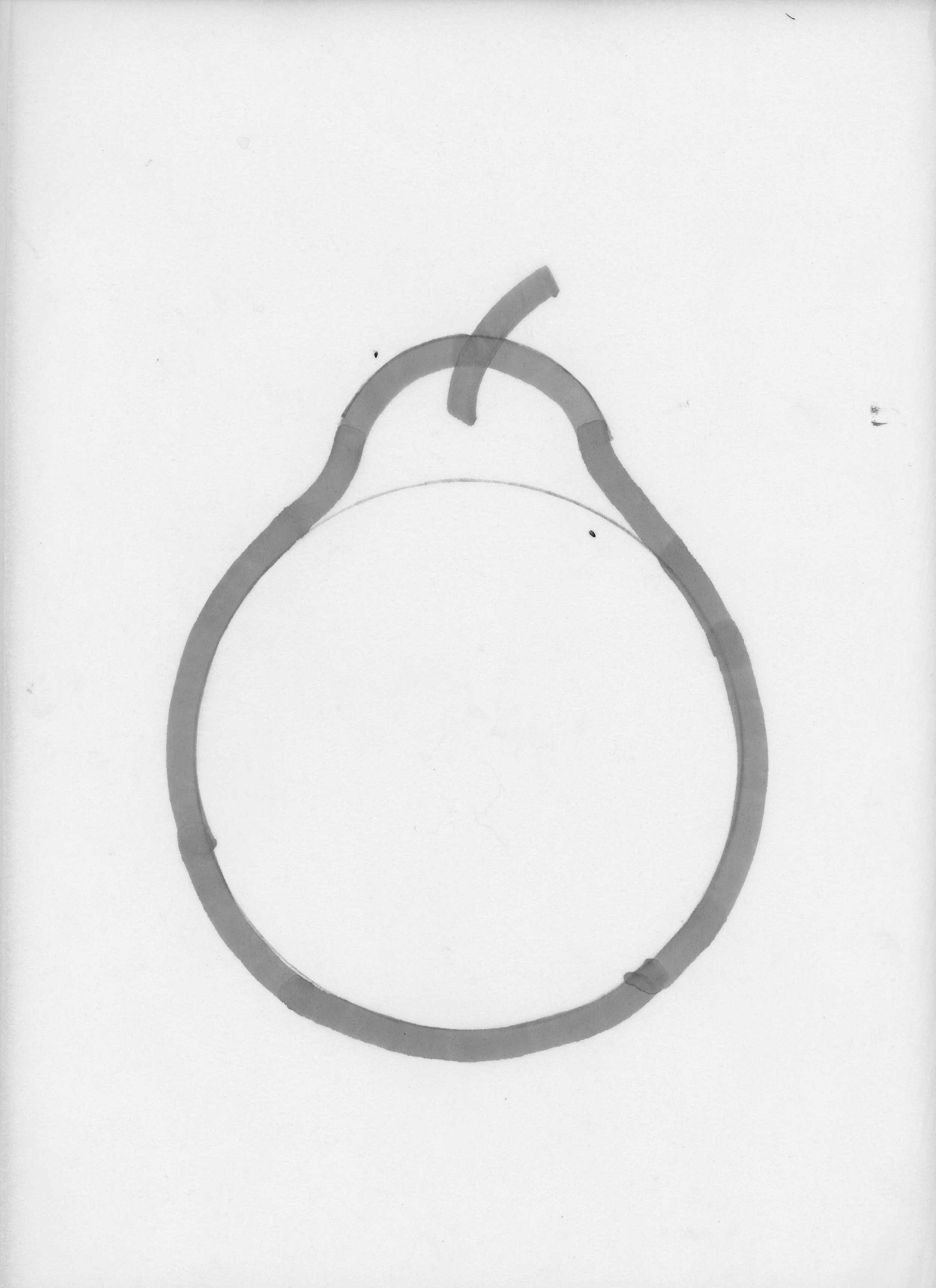
I was heavily influenced by the bright colors and simple illustrations that one might see in a 60’s cooking catalogue. Below are some preliminary sketches before treatment in photoshop. To achieve the desired look, I used a single stroke on a wide-tipped marker and traced around some light pencil sketches.


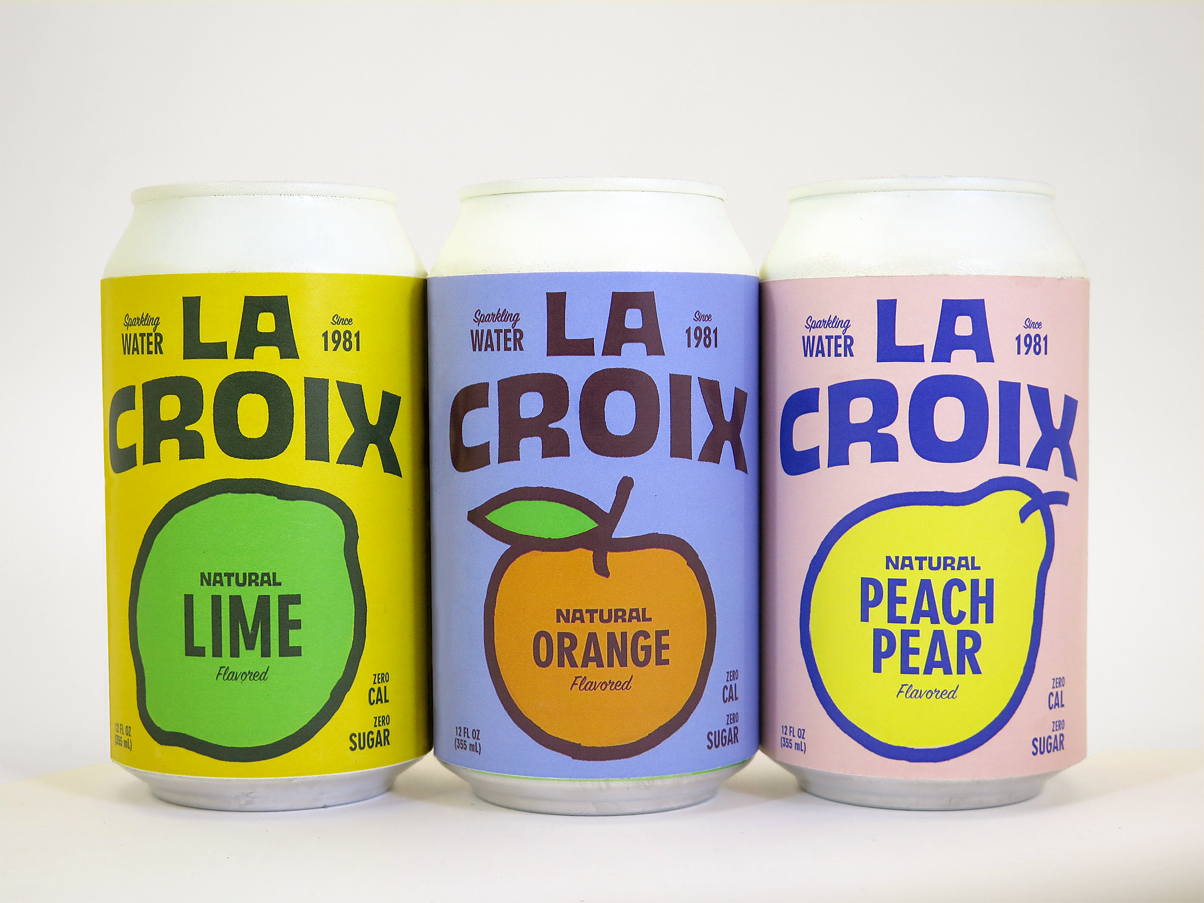
LABELS
Again, my influence looked to the roots of soda related products. Something that is straight forward, easy to read, and eye-catching. In order to match the bold strokes of the illustrations, I used primarily bold type. Below are the final labels prior to printing.


TAKEAWAY
As fun as I had with this project, due to printing resources, I was unable to give the top of the can any treatment, so I spray painted them white to contrast the poppy colors.